
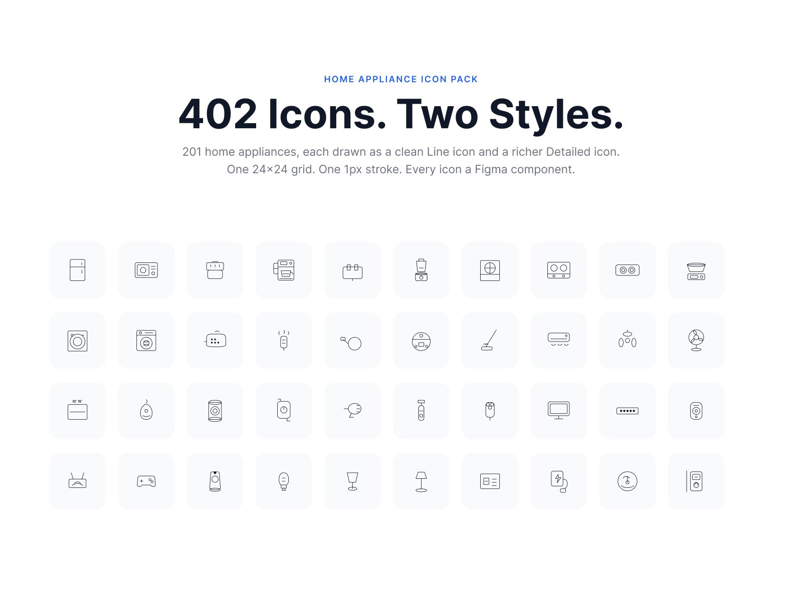
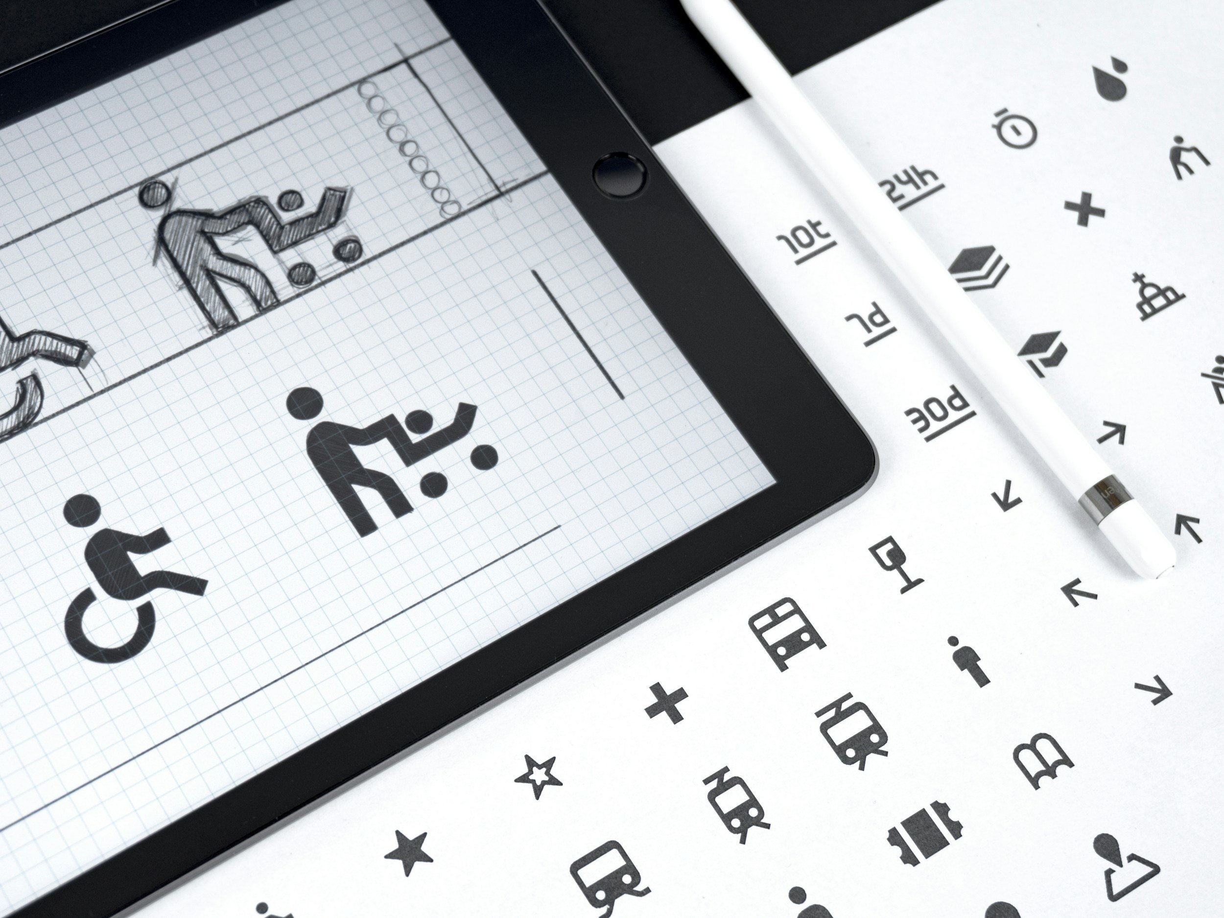
Icon & illustrations
This is the side of my practice that never made it into a product spec. Icons and illustration are what I do when the day job is done — small, slow, deliberate drawing on a fixed grid, where every pixel has to earn its place.
Why I keep drawing?
I came to icons the long way around. [I trained as / I've spent years as] a product designer, which means most of my working life is spent on systems, flows and trade-offs — necessary work, but abstract. Icons are the opposite. An icon is finished or it isn't. It reads at 16px or it doesn't. There's no stakeholder to talk it into working.
I started drawing them properly when [I kept hitting the same wall: the icon set we were using didn't have the one thing I needed, and the closest match was always slightly wrong]. So I drew the missing one. Then the next one. Somewhere in there it stopped being a workaround and became the part of the week I looked forward to.
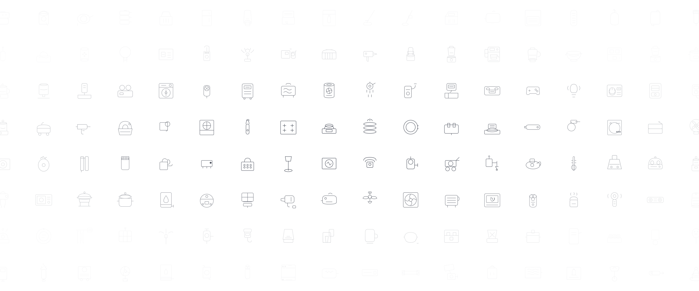
What keeps me at it is the constraint. One grid. One stroke weight. A shape either sits on the pixel or it doesn't. Working inside limits that tight is the most honest kind of drawing I know — you can't hide a weak idea behind a gradient.